


Flexbox and its common properties
How to create layout for webpage using flexbox?


Introduction
Hey! Did you know that Flexbox is like a container in HTML? It's kind of similar to div and box containers. But the awesome thing about Flexbox is that it can do more than just those containers, especially when it comes to scaling up to larger web pages. Flexbox gives programmers better control over the items inside the container because it can grow, shrink and align them in a more dynamic way. So, you get more freedom to style and control the content inside the container, which is super cool!
What is Flexbox?
Flexbox is a type of container So much like the div and box container that you can create using HTML. Flexbox can overcome the limitations caused by containers such as block and inline. So let's deep dive into Flexbox and understands its basic properties

Flexbox is single-dimensional, which means you can align it either along a row or a column and it is set to row alignment by default.
There are two axes, the main and cross-axis, much like the x and y-axis used in coordinate geometry. When aligned along the row,
the horizontal axis is called the main axis and
the vertical axis is called the cross axis.
For the items present inside the flexbox container, the placement starts from the top-left corner moving along the main or horizontal axis. When the row is filled, the items continue to the next row. By default, the flex direction is a row
Note that with the help of a property called flex-direction, you can instead flip the main axis to run vertically and the cross axis will then be horizontal. In such a case, the items will start from the top left and move down along the vertical main axis. We will learn about that later in this blog.
Basic Markup to Understand Flex
Below is the basic markup for understanding flex. I have embedded codepen to ease the understanding of flex. Try different properties and find out how they went in the browser as I think CSS is more of practicing and visualizing things. Click on HTML/CSS to see the respective codes.
The .flex-container class has seven div in it which means that flex-container has seven child elements in it and each child has its different class .box box1, .box box2 .... so on. So there are seven div containers inside the HTML file. The corresponding CSS file contains rules for all seven div tags that have the box class.
Note: Two class names are given for each of the tags, one that is common among all classes and another independent of it. The style is applied to all the containers.
Now let’s add properties to the flex container by converting it into flex. The basic syntax to make a flex layout is to give the parent class display: flex;
.flex-container{
    display: flex;
}
So when we apply the flex property to it then all the elements move along the main axis. The immediate child of the parent changed from a block element. All child element covers the width of the screen according to their width.
Different flex properties and their benefits.
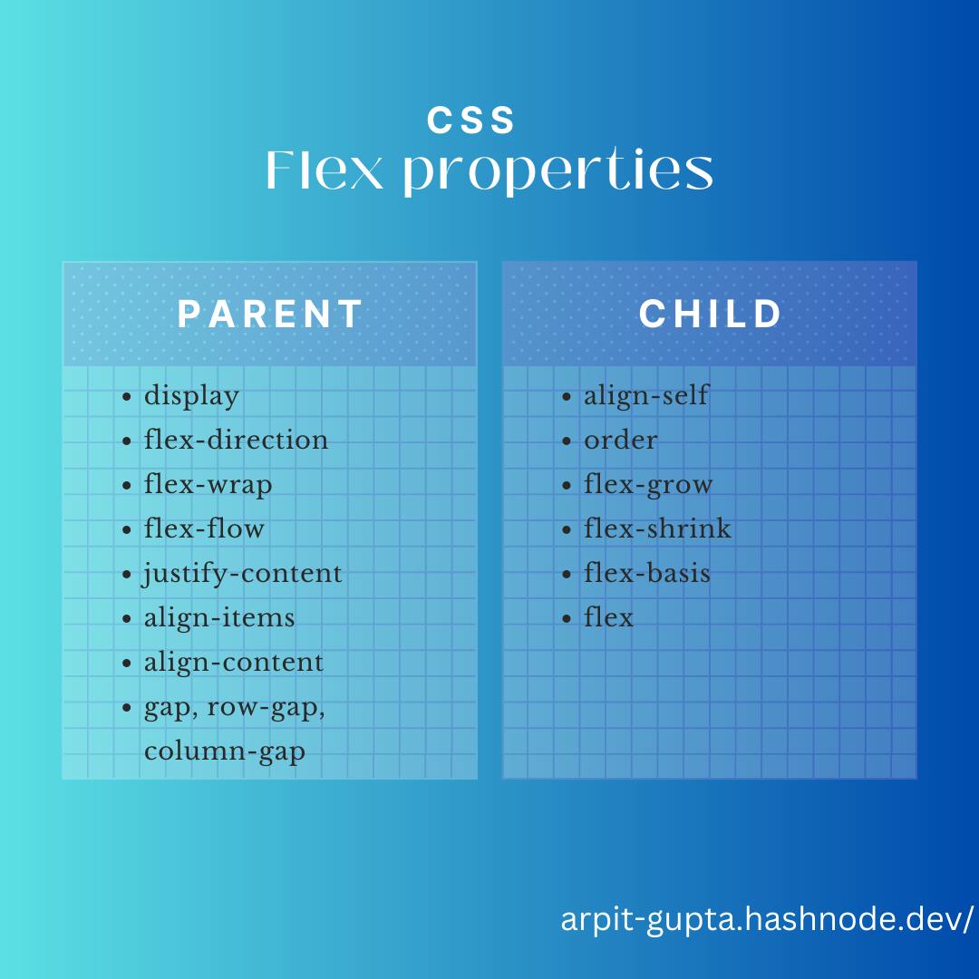
the properties you choose will help you better control alignment, spacing, direction and eventually styling of the container and items present inside it. Basically based on which element we can apply the properties, we can divide the flex-properties into two:-
properties applied on the parent
properties applied to the children
So let's discuss each property one by one ;
properties applied on the parent
flex-direction:
This property is used to set the main axis, which is a ‘row’ by default. It means you are changing your ‘main’ axis from horizontal rows to vertical columns.
Syntax: flex-direction: row | row-reverse | column | column-reverse;
The various property and what does it do is commented in the CSS file.
flex-wrap;
The default for this property is ‘nowrap’ which means the items will span the entire width of the axis. By default, flex items will all try to fit onto one line. You can change that and allow the items to wrap as needed with this property.
Syntax: flex-wrap: nowrap | wrap | wrap-reverse;
When we give it the property of wrap; all flex items will wrap onto multiple lines, from top to bottom.
flex-flow
This is a shorthand for the flex-direction and flex-wrap properties, which together define the flex container’s main and cross axes. The default value is row nowrap.
.flex-container {
  flex-flow: column wrap;
}
Alignment properties
Let’s examine a few alignment properties inside the flex. Align items are stretch by default. There are four main properties used to align a flex container and the items present inside it i:e its children.
justify-content. For item alignment on the main axis.align-items. For item alignment on the cross-axis.align-self. For unique flex items on the cross-axis.align-content. Used for packing flex lines and control over space.
Of these, justify-content and align-items are frequently used for the respective two axes.
justify-content
The default for this property is ‘flex-start' which means that items are packed toward the start of the flex-direction.
Syntax: justify-content: flex-start | flex-end | center | space-between | space-around | space-evenly | start | end | left | right
Let’s first examine the use of justify-content which has a value of ‘flex-start’ by default. We will change it to the center When we change the property, all elements move from the left toward the center.
align-items
Syntax: align-items: stretch | flex-start | flex-end | center | baseline | first baseline | last baseline | start | end | self-start | self-end
This defines the default behavior for how flex items are laid out along the cross-axis on the current line. Think of it as the justify-content version for the cross-axis (perpendicular to the main axis). The alignment on the cross-axis is done with the help of this property.
Let’s change the value for it to ‘flex-end’. We can see that all the content will be moved towards the end of the flex.
The term ‘end’ refers to the right side of the page as the left side is seen as the beginning.
gap
Syntax: gap:relative||absolute unit
gap property can be used to create space between the items along the main axis. We can set the gaps in rows and columns using row-gap and column-gap properties. The gap property explicitly controls the space between flex items. It applies that spacing only between items not on the outer edges.
When we set gap:20px, we can see there is a clear change in spacing between the items.
Properties For the children:
align-self:
syntax: align-self: auto | flex-start | flex-end | center | baseline | stretch;
This allows the default alignment (or the one specified by align-items) to be overridden for individual flex items. This property can be used on individual items inside the flex. If we want to place certain items in a specific position.
So, here we use class .box3 to move that particular box to the center by giving it the property of align-self:center. It moved the element to the center of the screen
order
By default, flex items are laid out in the source order. The default value of the order is set to 0 However, the order property controls the order in which they appear in the flex container.
Syntax: order: 5;
Flex
The final set of properties is flex-grow, flex-shrink and flex-basis. Together these determine how the flex takes up space, grows or shrinks according to the space available.
These are the sub-properties of a property called flex. Together all three properties can also be given values with the help of something called shorthand notation in CSS. Shorthand notation helps you make your code compact and also easy to write and follow. The values left empty in shorthand notation are given their default values.
Flex-basis: The initial size of a flex item before any additional space is distributed within the flex container. If set to
0, the extra space around content isn’t factored in. If set toauto, the extra space is distributed based on itsflex-growvalue.Flex grow: The ability for a flex item to grow if necessary as a Flex element intelligently tries to distribute space along its elements or children. This property determines how much the flex item should expand to fill any available space within the flex container.
Flex shrink: This defines the ability of a flex item to shrink if necessary. This property determines how much the flex item should shrink if there's not enough space available within the flex container.
Here for the flex-container class, there is a set rule for the flex property. The values correspond to the three properties, namely the flex-grow set to 0, flex-shrink to 1 and flex-basis to auto. The flex-basis sets the initial size of the container. and together they define the rigidity or flexibility and dynamism you want to add to the flexbox.
Flexbox Games: Interactive Way to Learn
By Flexbox games, I mean that you can practice/learn Flexbox by playing games. I came across these two websites that might help you to practice flexbox skills. These websites help you to learn the concept more interactively. Give it a try!
Conclusion
This blog provides an overview of Flexbox. It explains the main and cross-axis, alignment properties such as justify-content and align-items, and other properties like flex-direction, align-self, and gap. Additionally, it discusses flex-grow, flex-shrink, and flex-basis, which together determine the flexibility and dynamism of a flexbox.
The entire collection on Codepen is available. Go fork and play with it to understand how each property works.